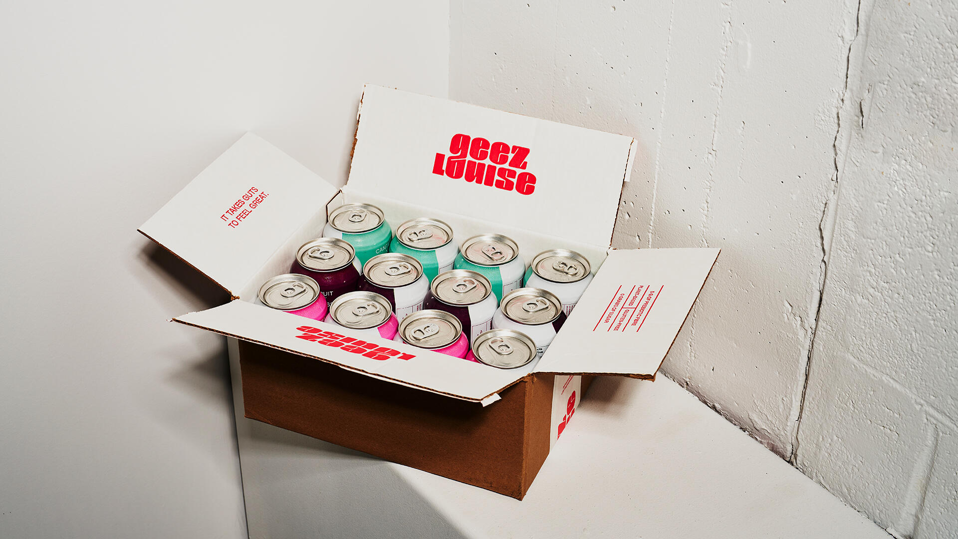
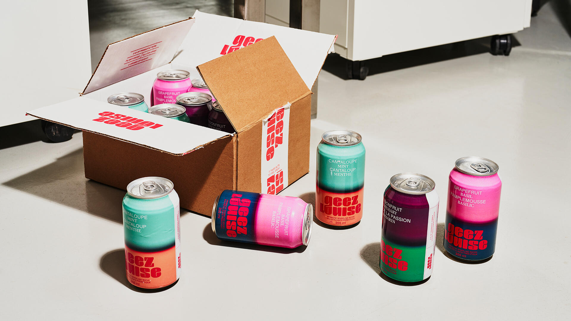
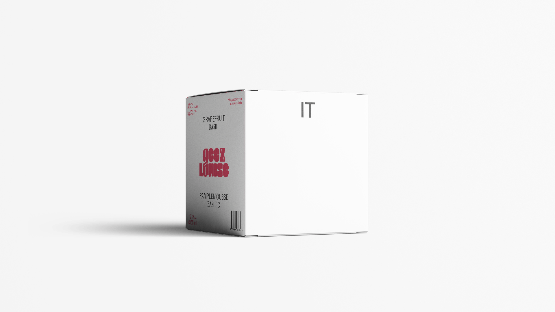
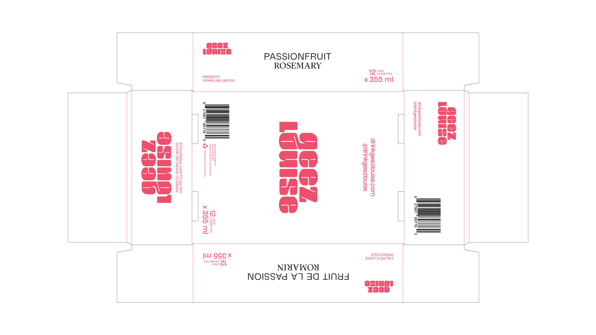
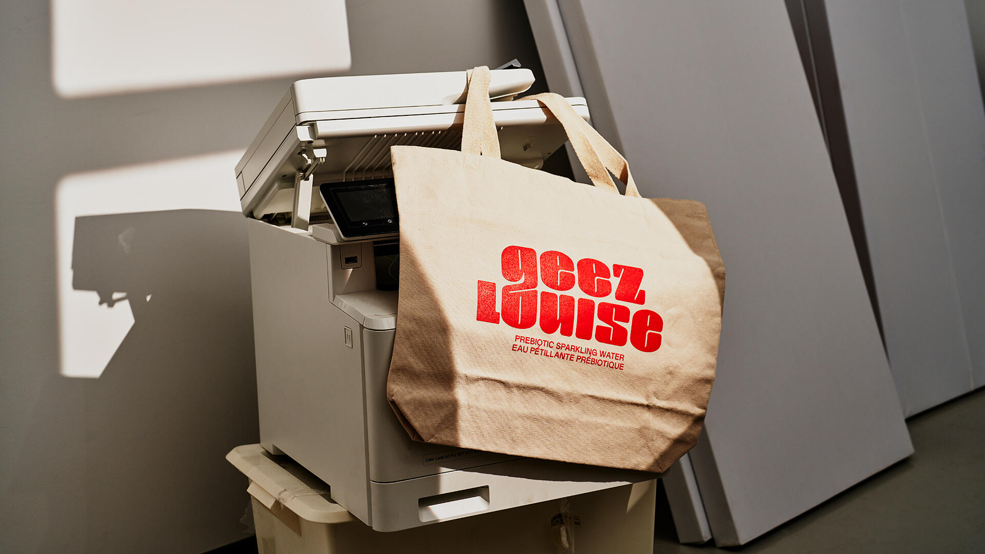
Geez Louise is a wildly delicious functional sparkling water that includes a whopping 5 g of prebiotic fibre per can. They are all about crave-worthy flavour that’s also good for you.
They approached Polygraphe to create a brand identity that came across as clever, quirky, a little offbeat yet smart. The brand needed to appeal to a health-conscious croud as well as a broader audience of Millenials and Gen X.
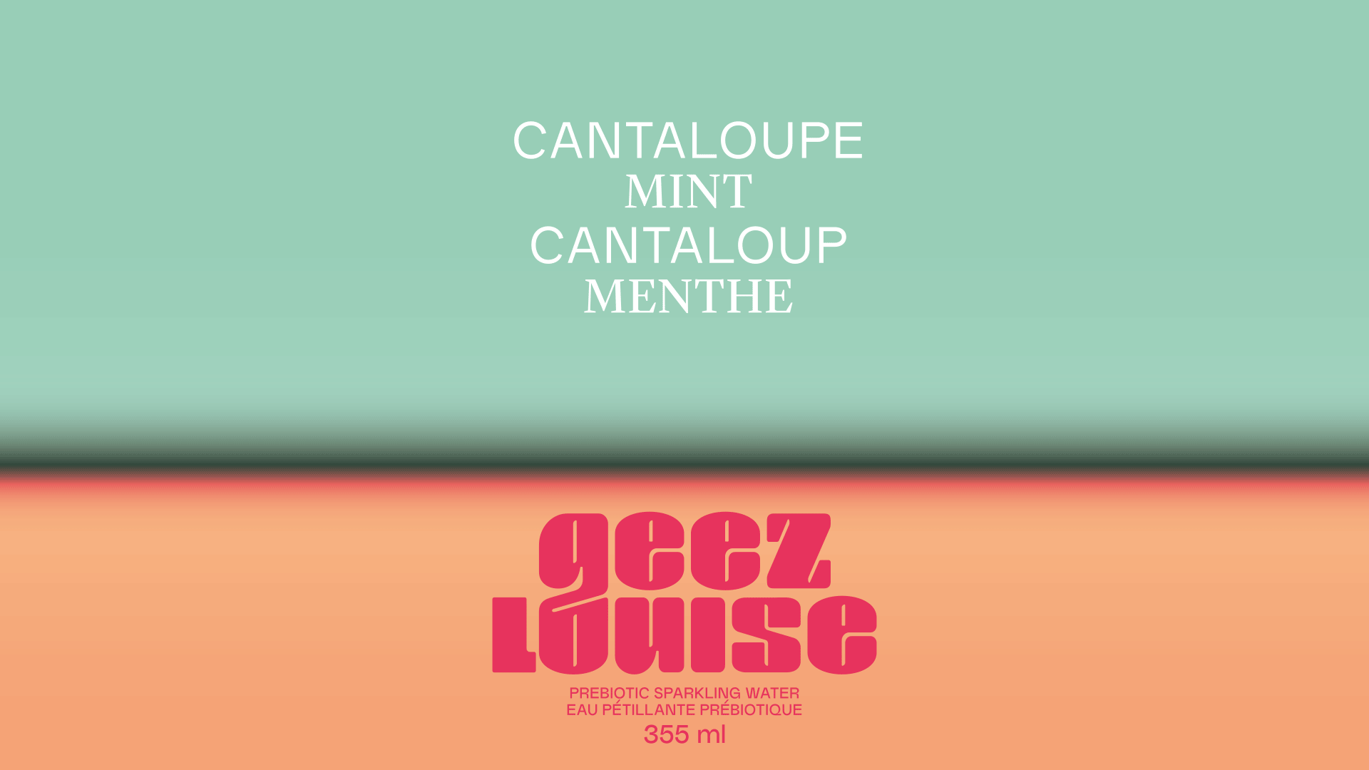
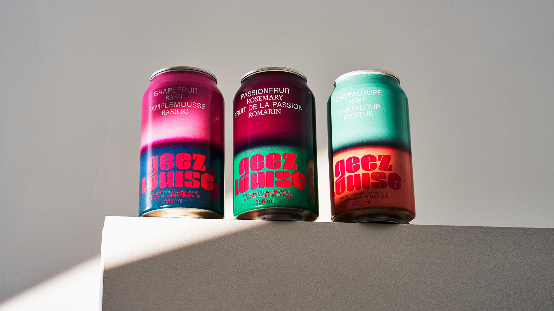
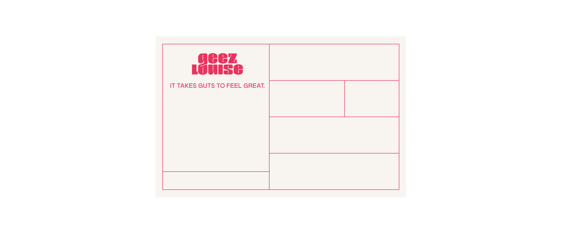
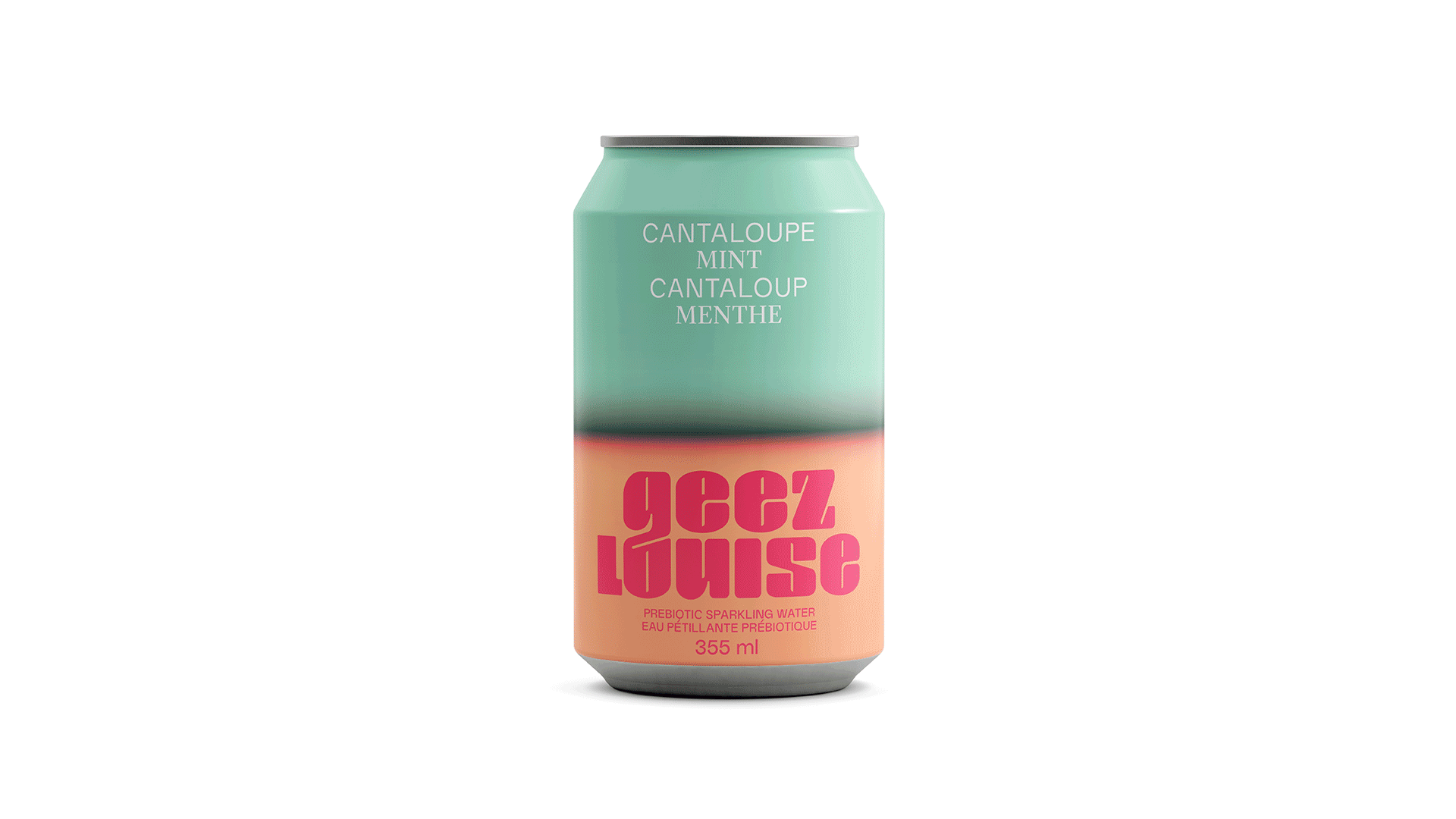
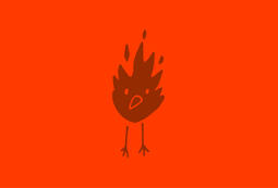
A balance between serious and fun was key. The logo, plump and podgy, contrasts with rigourous typographic layouts. The packagings are dressed with unusual colour combos, representing the bonding between both ingredients defining each flavour. Their new motto - It take guts to feel great! - is genuinely representative of who they are.
Photo - Thanh Pham


Archives +

Geez Louise - Packaging