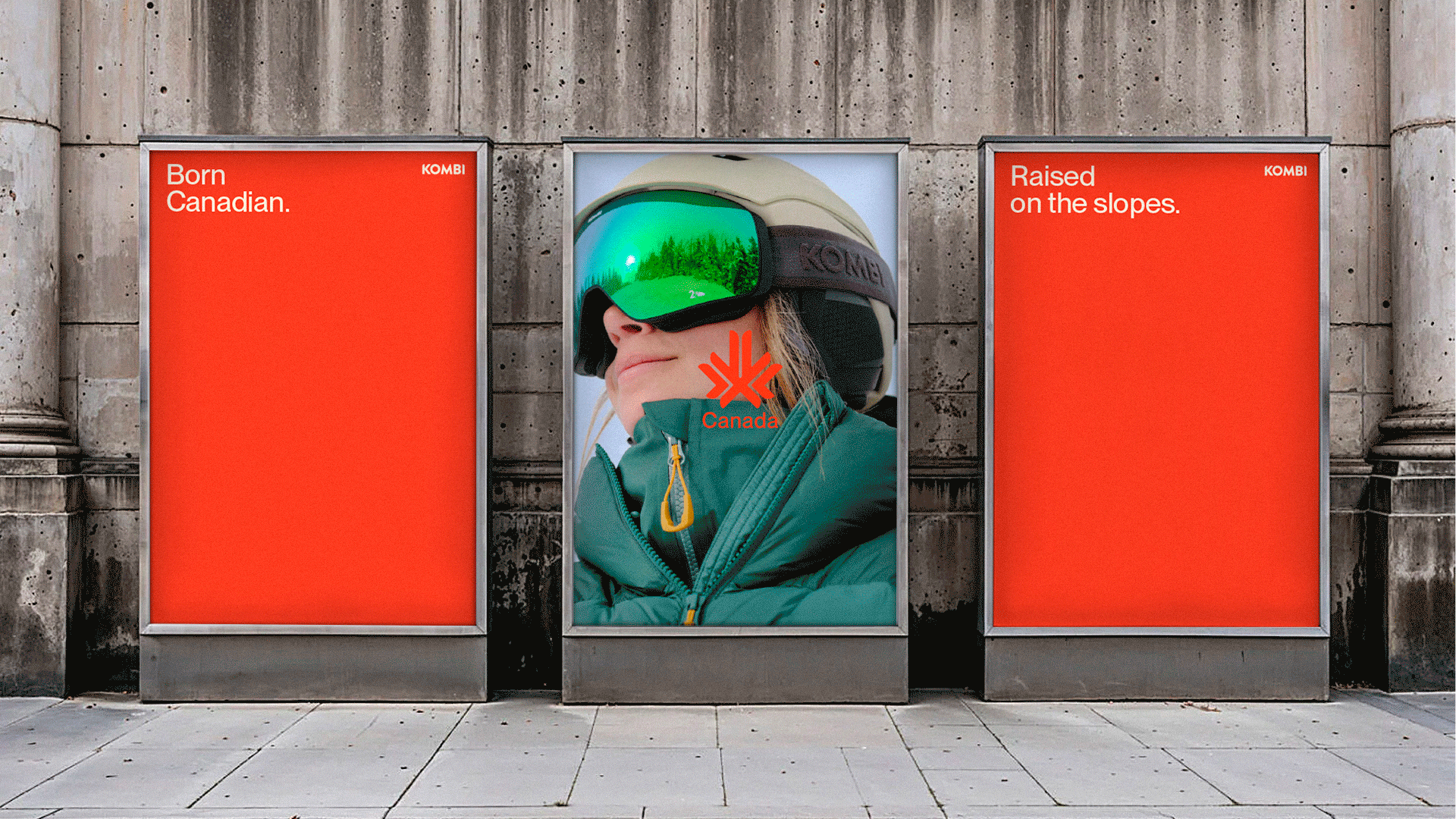
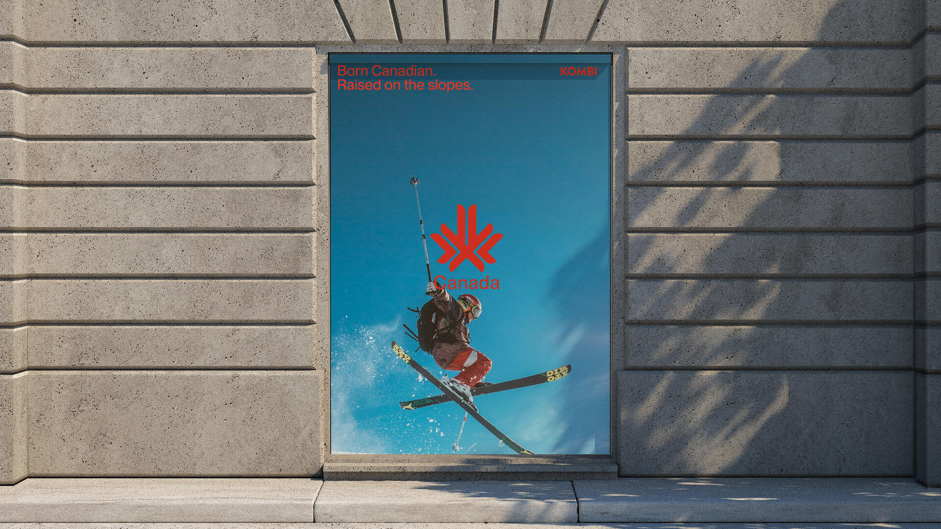
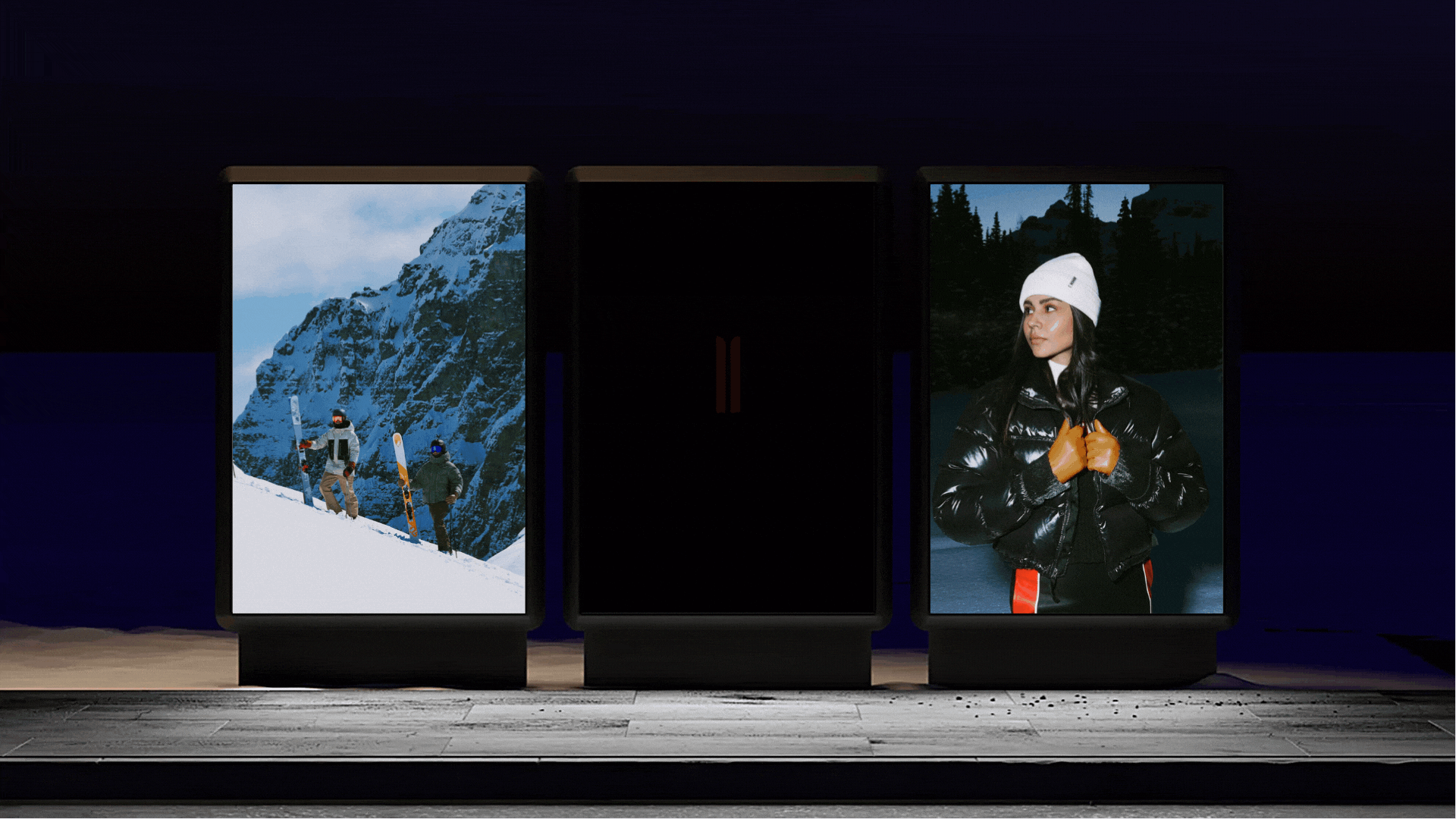
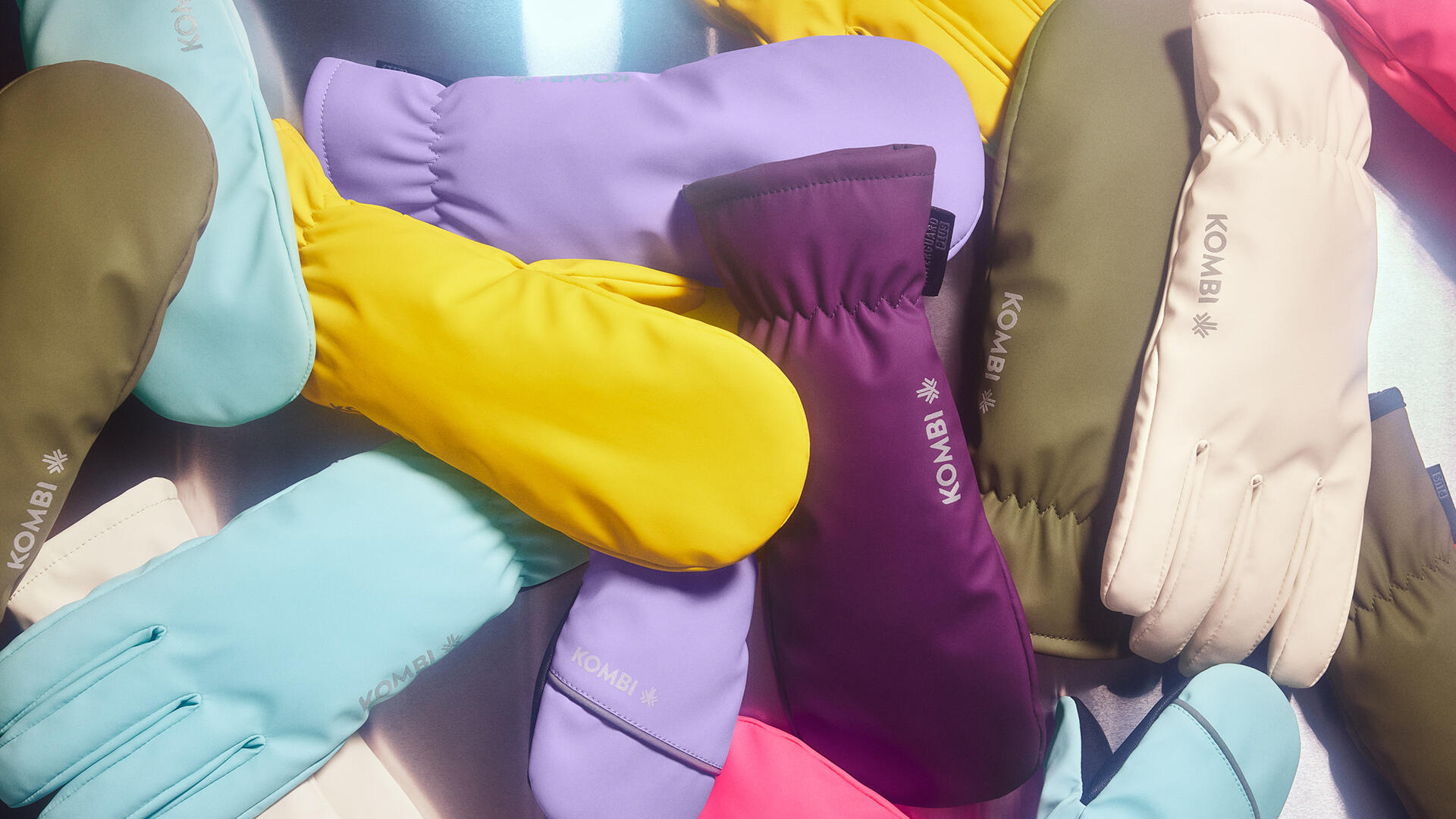
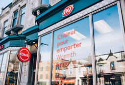
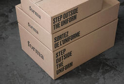
With a desire to affirm its Canadian roots and honour its ski heritage, Kombi has undertaken a comprehensive brand refresh. This evolution results in a new logo and a cohesive, distinctive graphic system firmly anchored in the brand’s DNA.
The logo is directly inspired by the shape of a ski—a simple yet powerful symbol that, when animated, evokes both a snowflake and the maple leaf. This graphic element becomes the cornerstone of the visual platform and unfolds into a modular system designed to facilitate clear, functional, and memorable brand recognition.
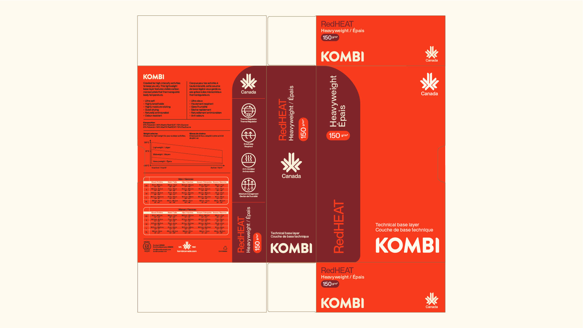
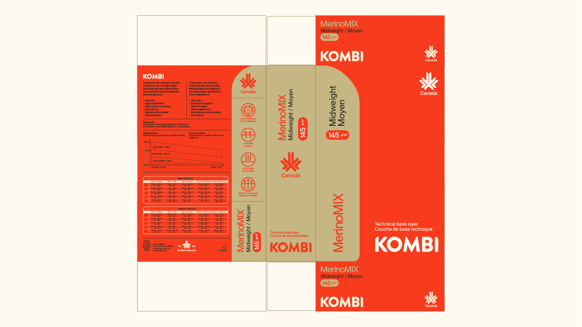
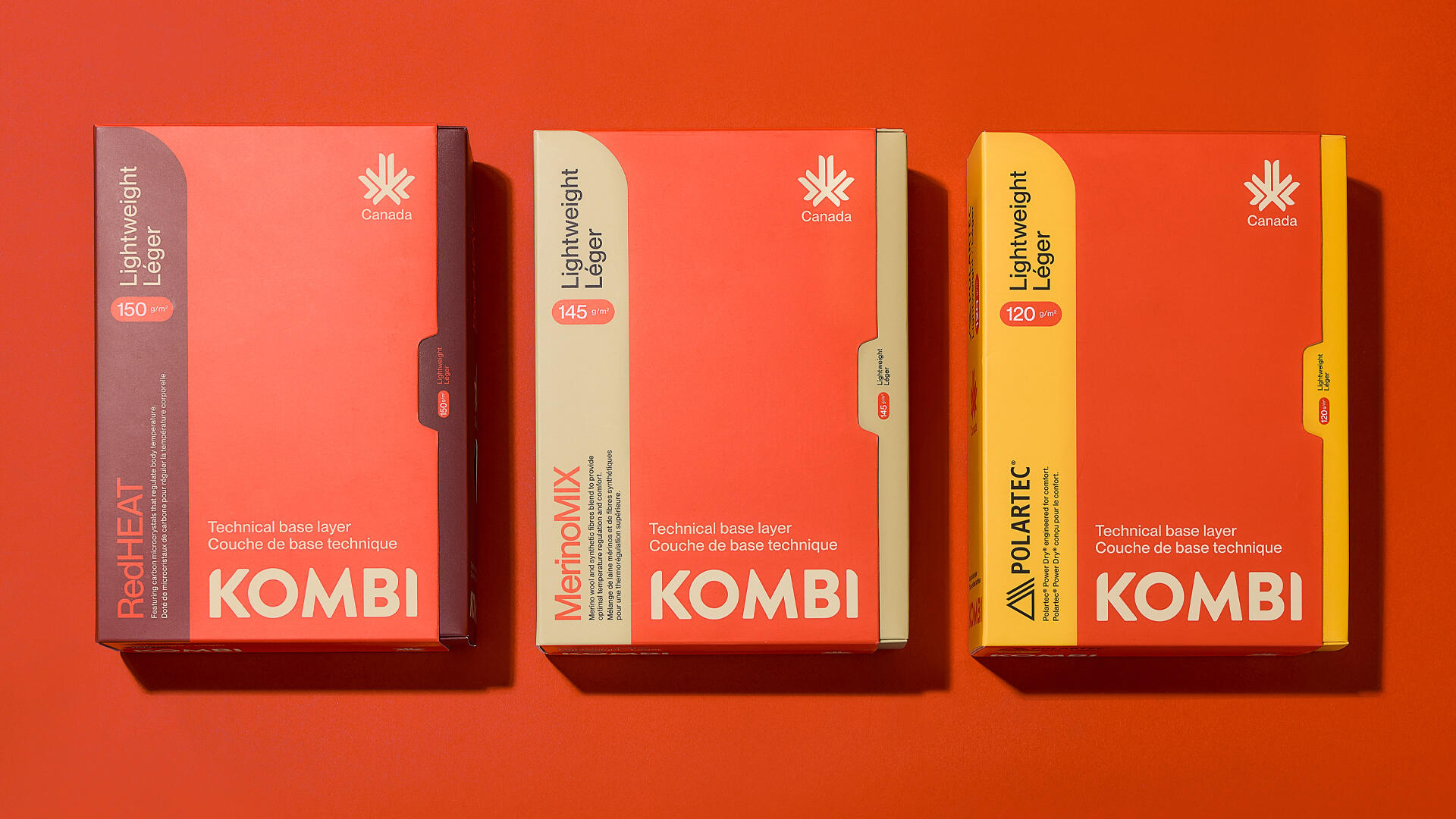
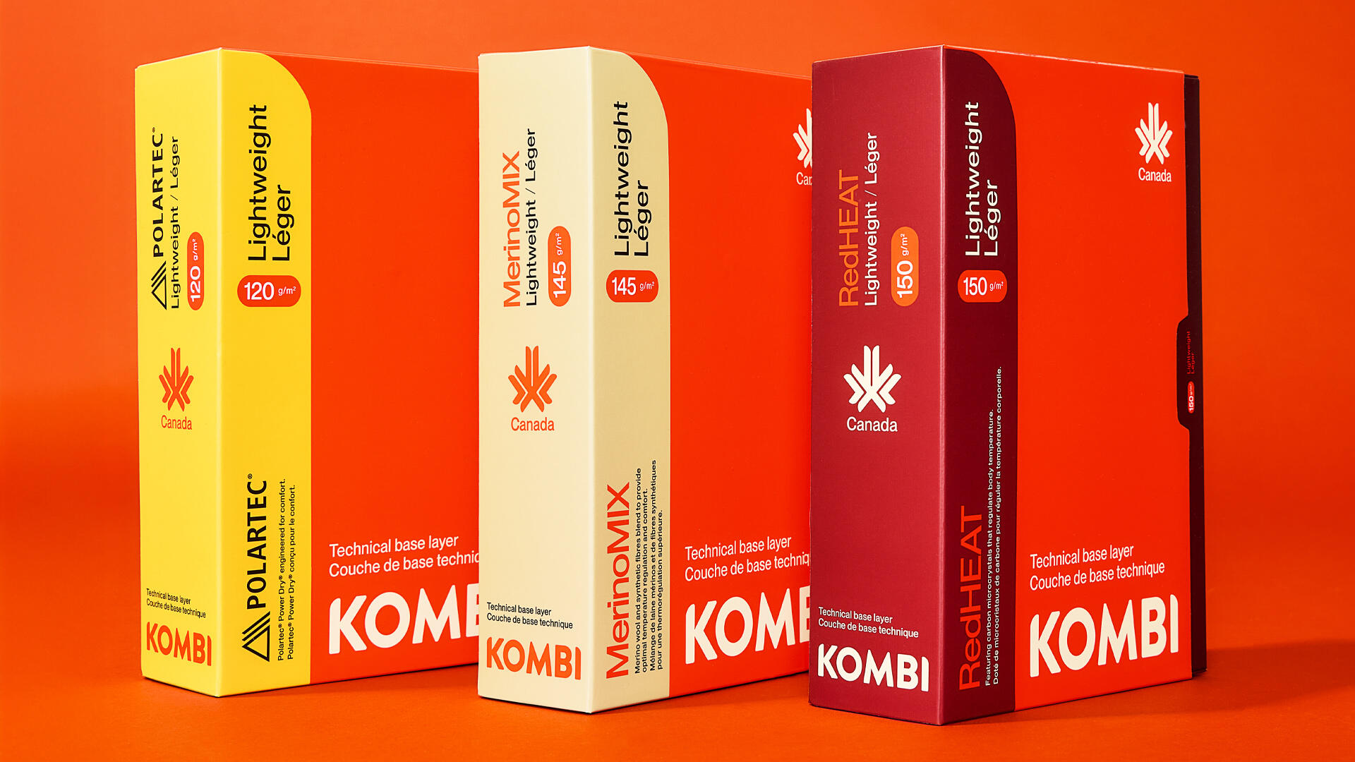
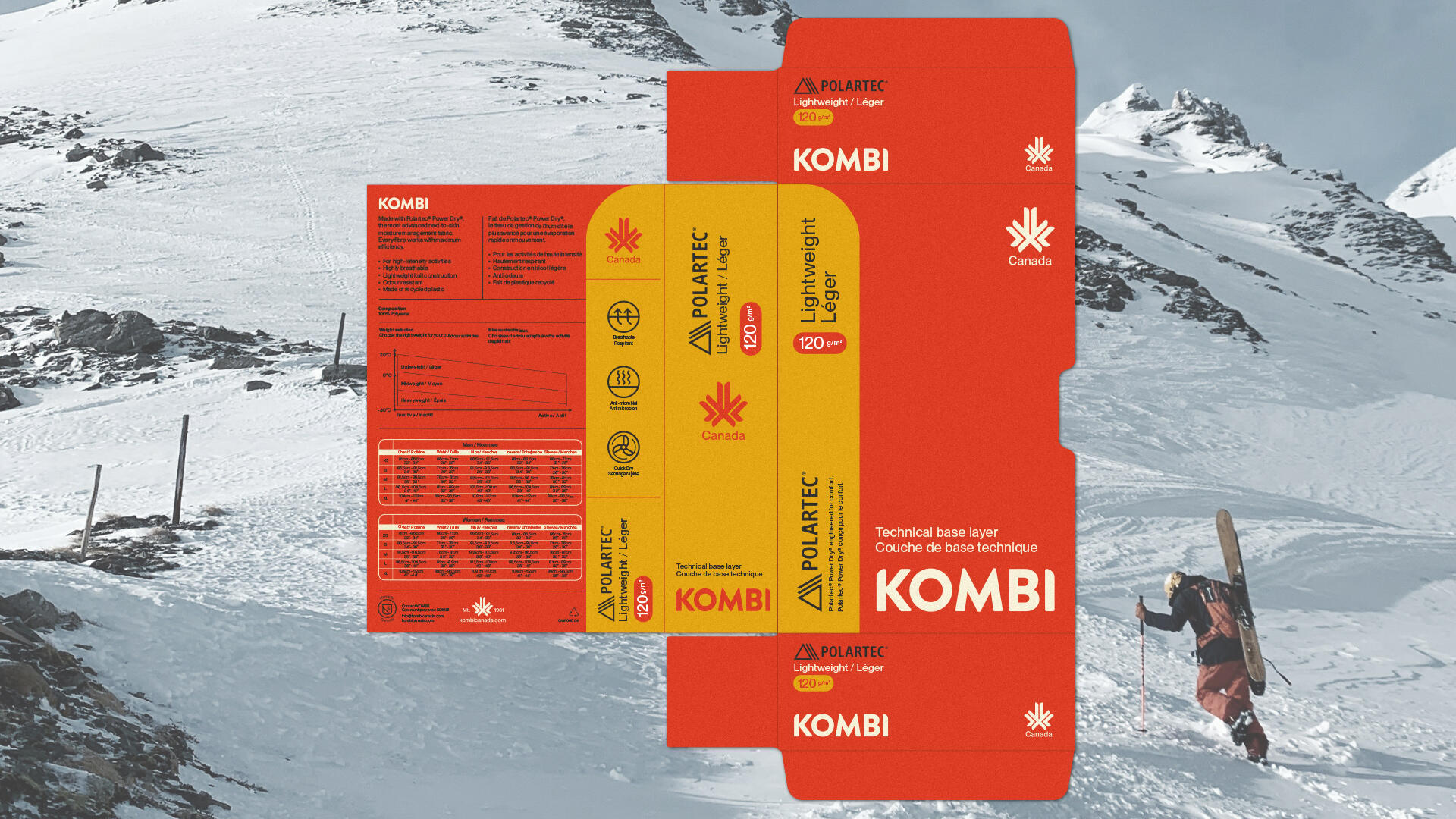
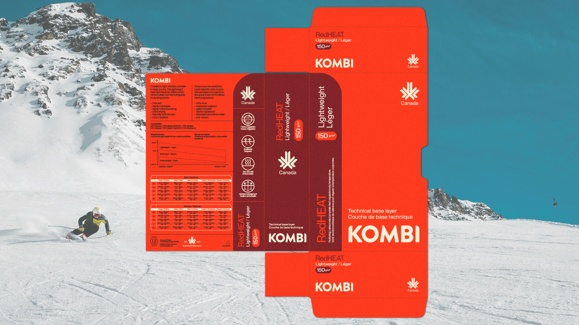
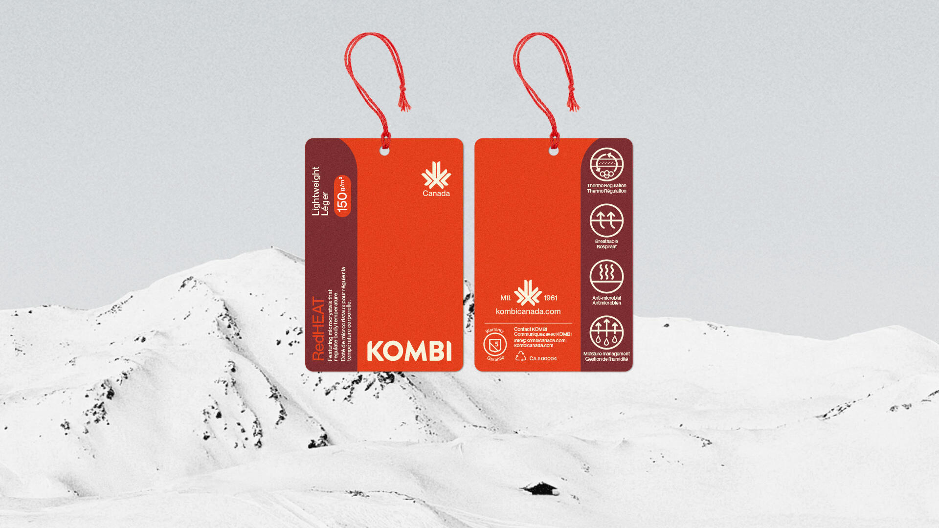
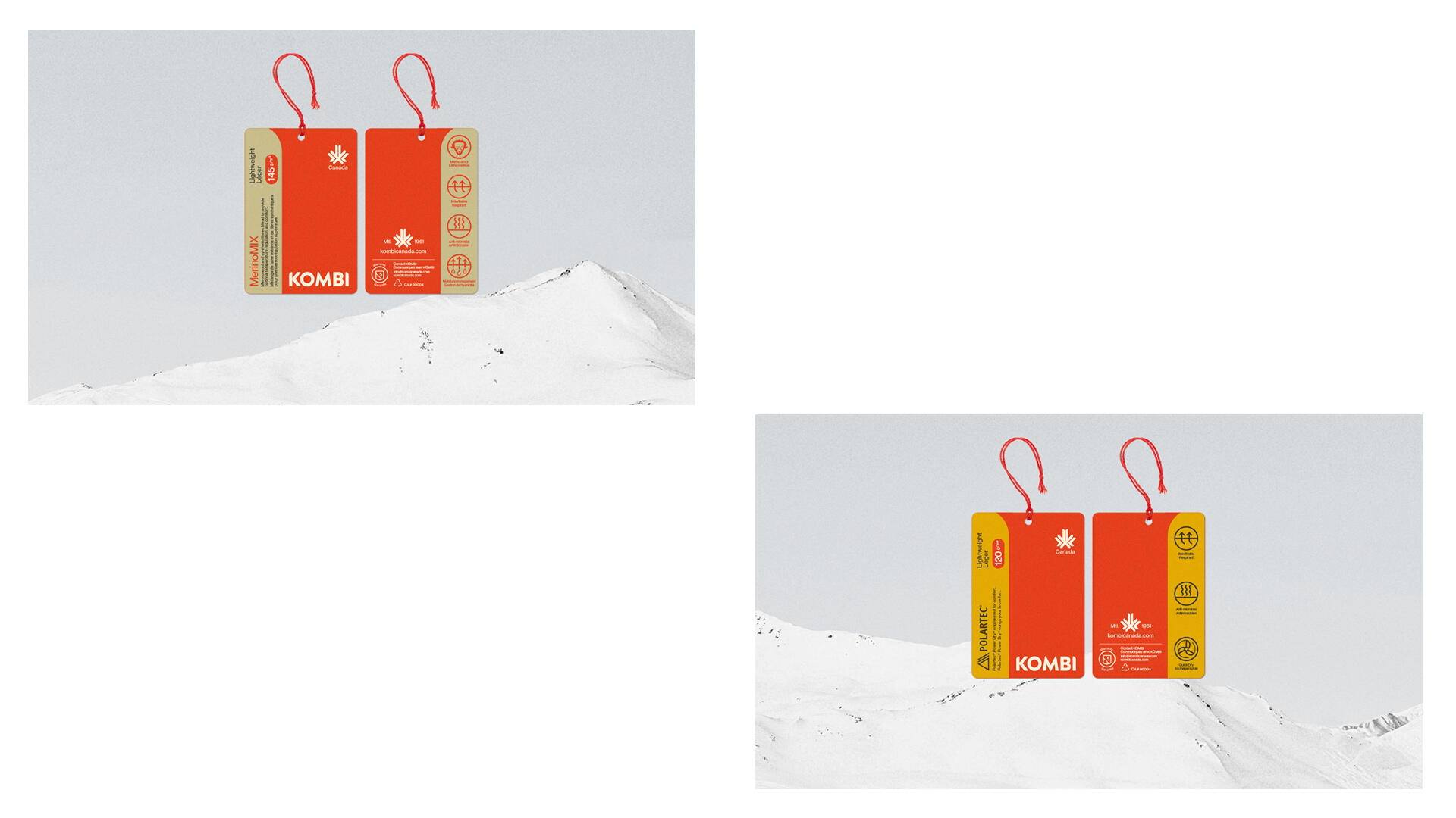
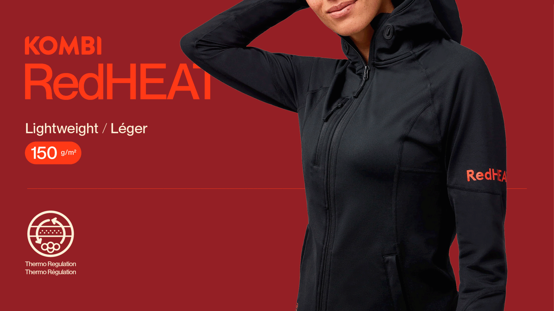
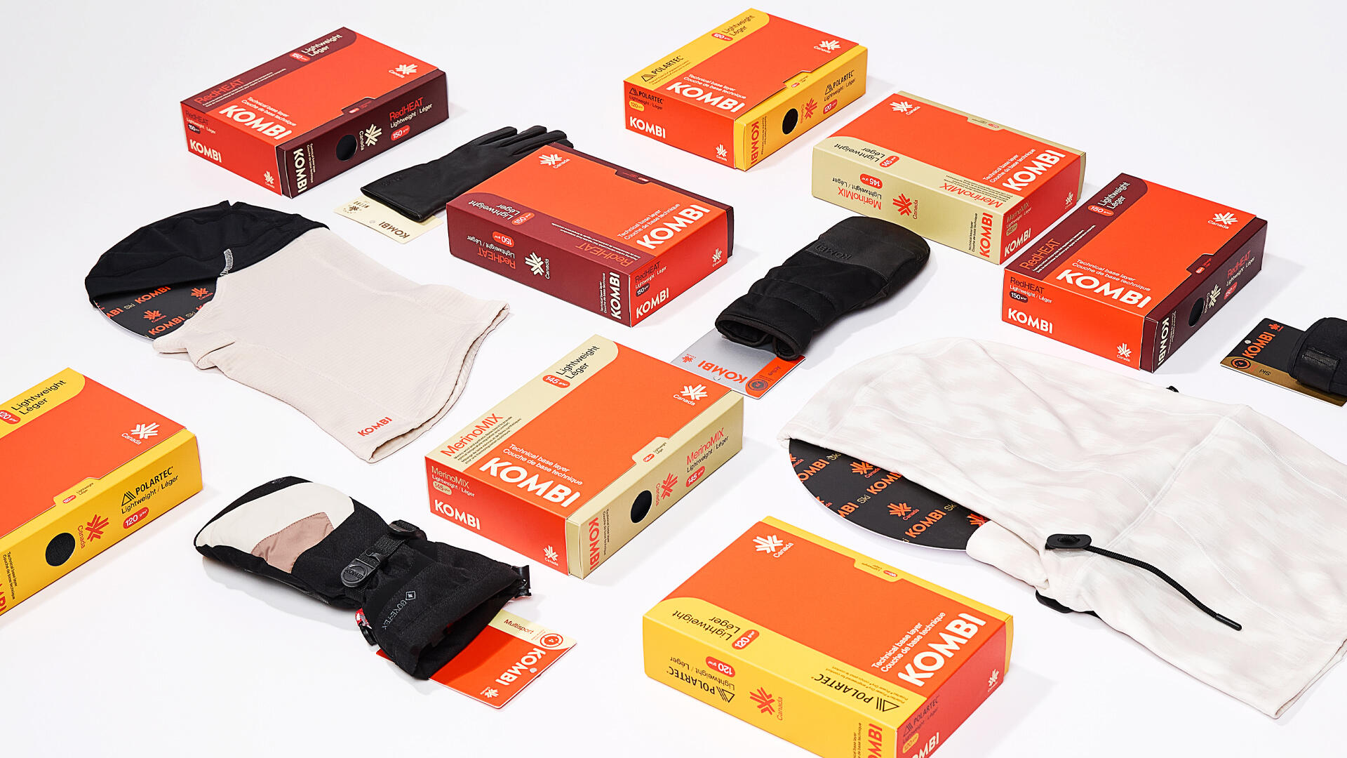
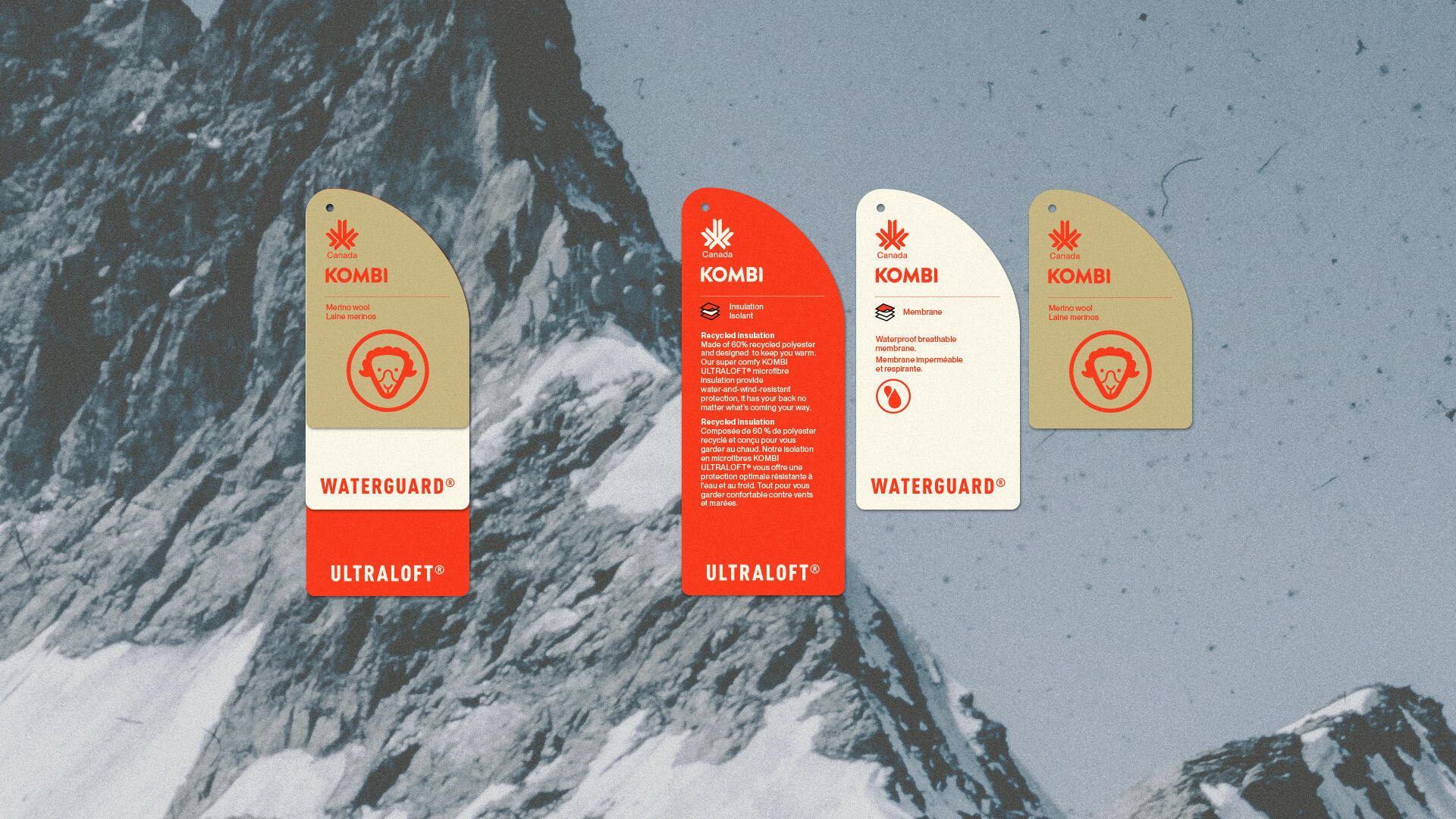
For the identity and packaging, Polygraphe emphasized the performance aspect of the products through a more technical grid, focusing on the clear communication of key attributes. The system’s rigor allows for a strong distinction between product families while maintaining overall visual consistency. Firmly rooted in contemporary design, this new identity positions Kombi in a modern context while proudly affirming its origins and craftsmanship.
Photography : Virginie Gosselin, Kelly Jacob, Hugo Hamaoui
Motion design : Nelly Nguyen
Video : Matt Charland, Oli Chapo
Lifestyle campaign : superbonjour
kombicanada.com


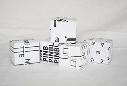
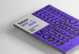
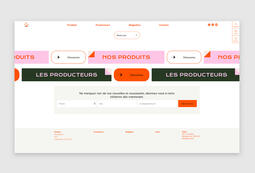
Archives +


Kombi Logo