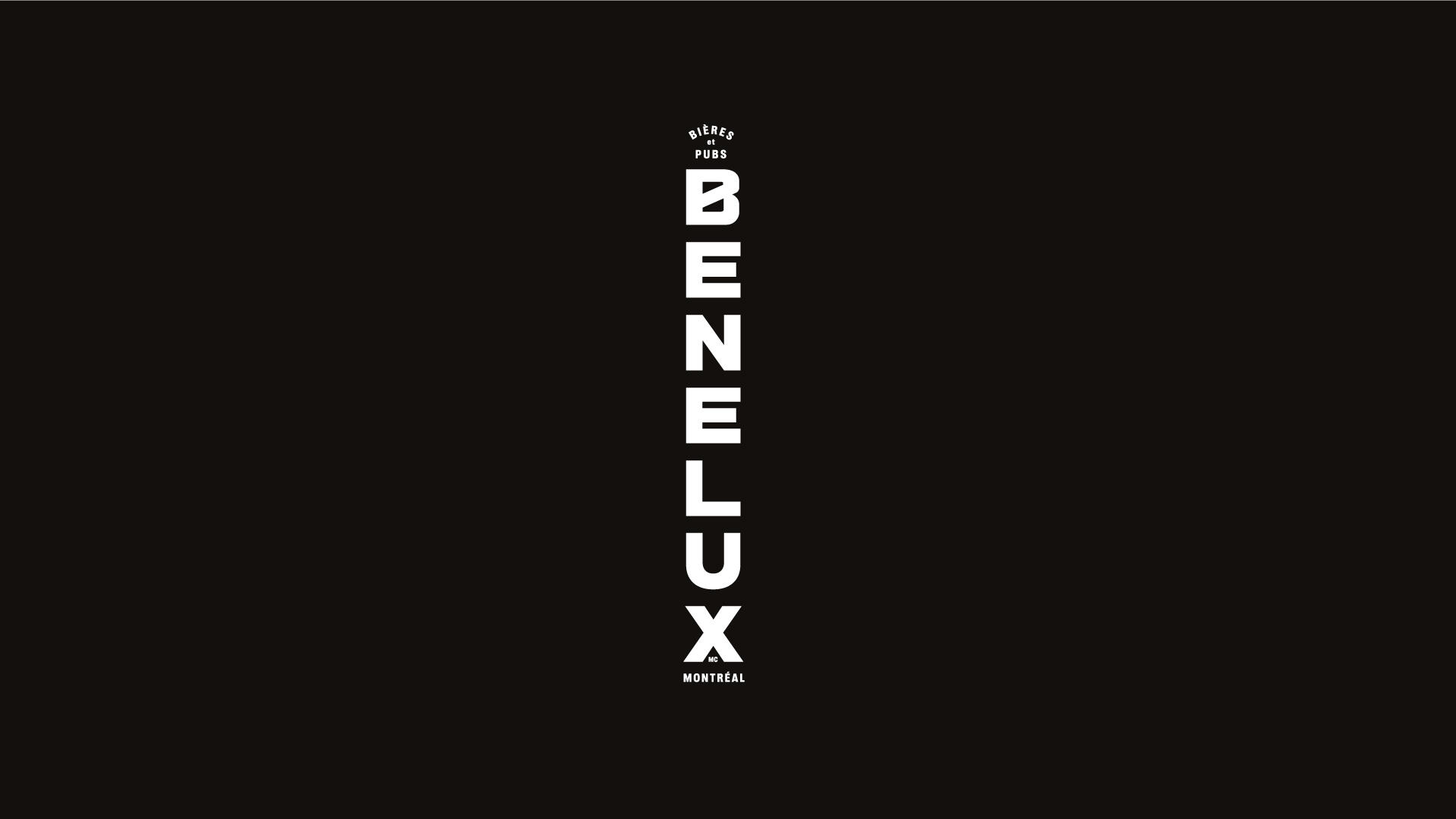
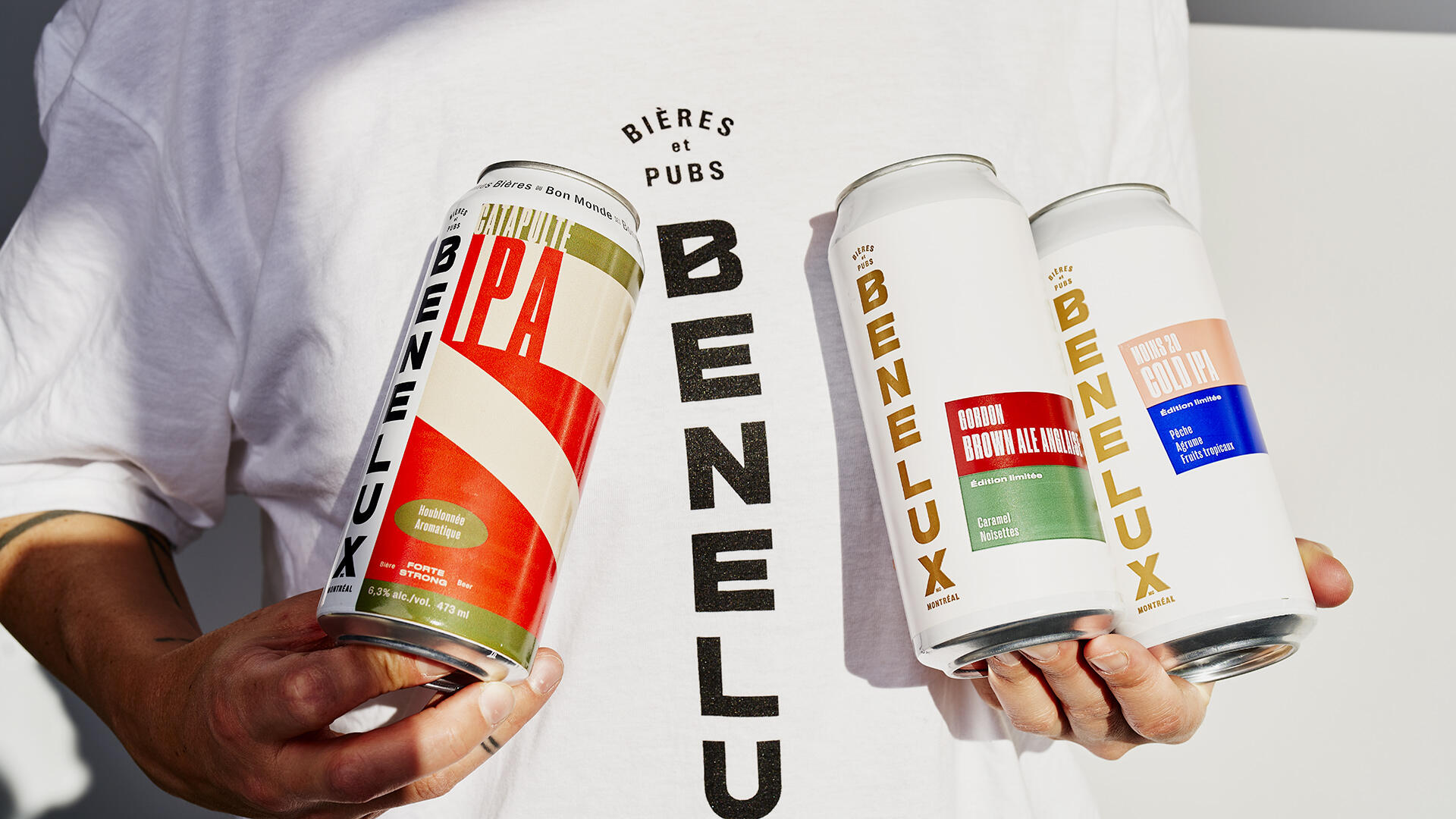
Benelux: a microbrewery, two pubs, dozens of beers and a cheerful bunch making things happen. Now ready to storm the retail marketplace, they came to us for a full branding and packaging redesign.
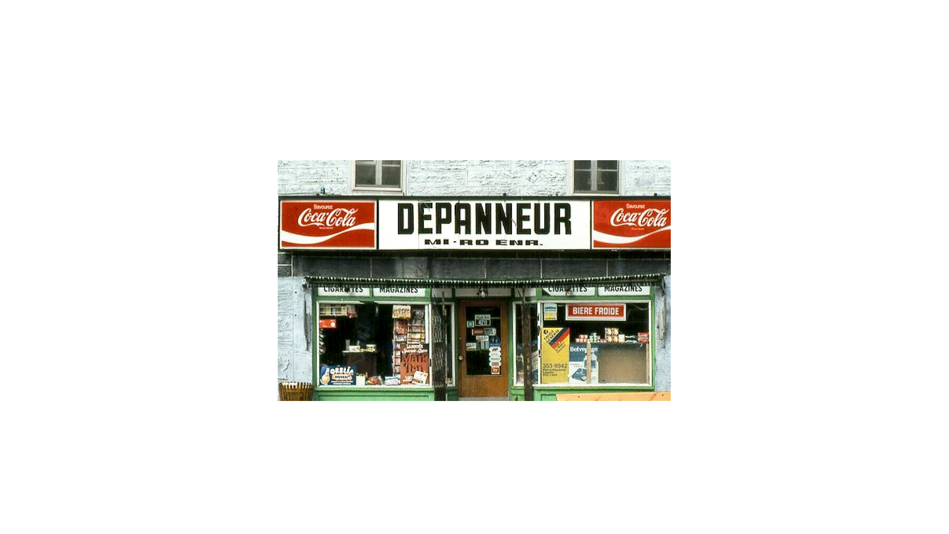
Well-established for years - thanks to its popular brewpubs - Benelux seeks to strenghten its Montreality via a new platform inspired by local popular landmarks. Industrial facades, corner store canopy or other emblematic vernacular signposts become limitless inspirations.
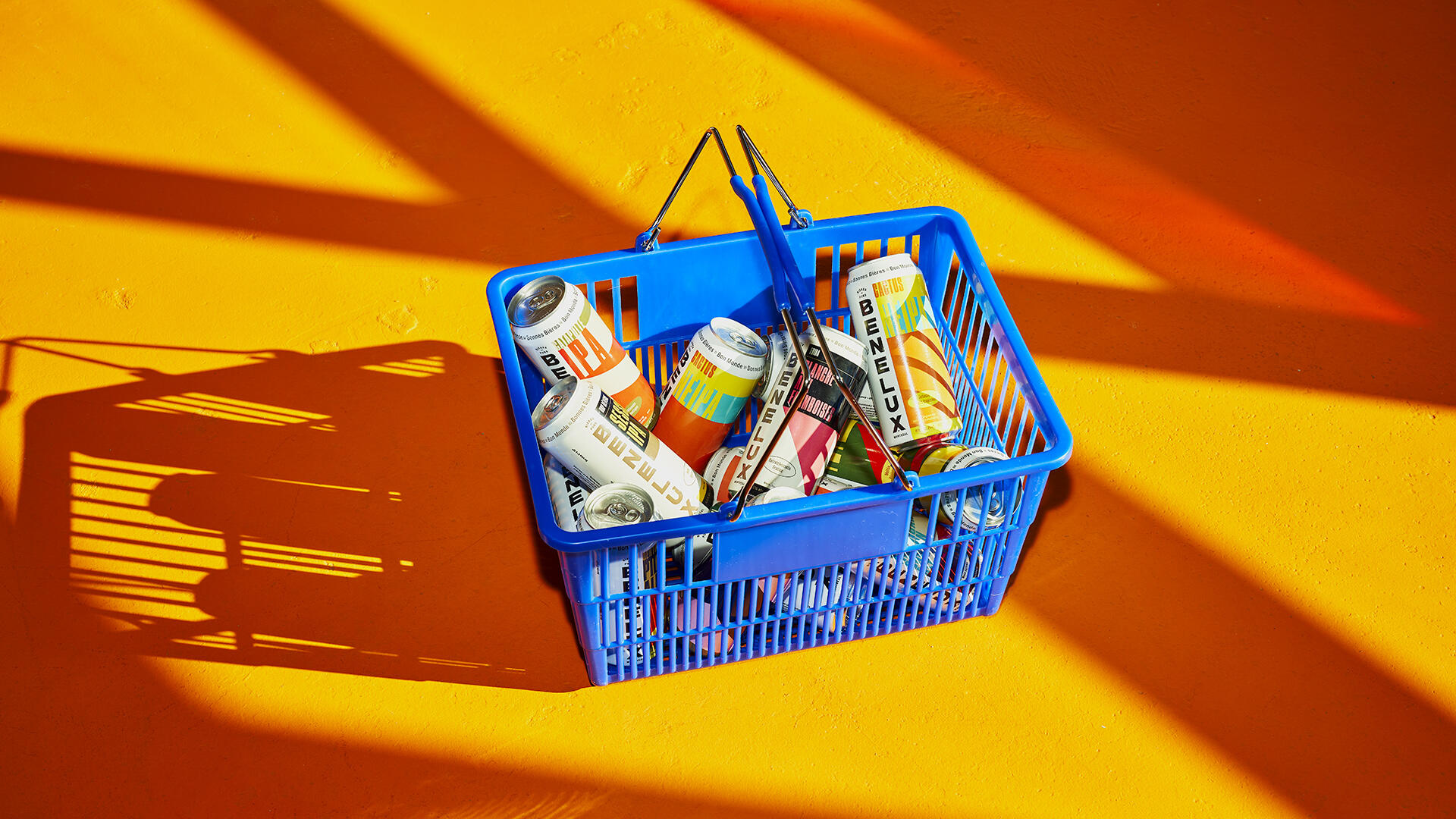
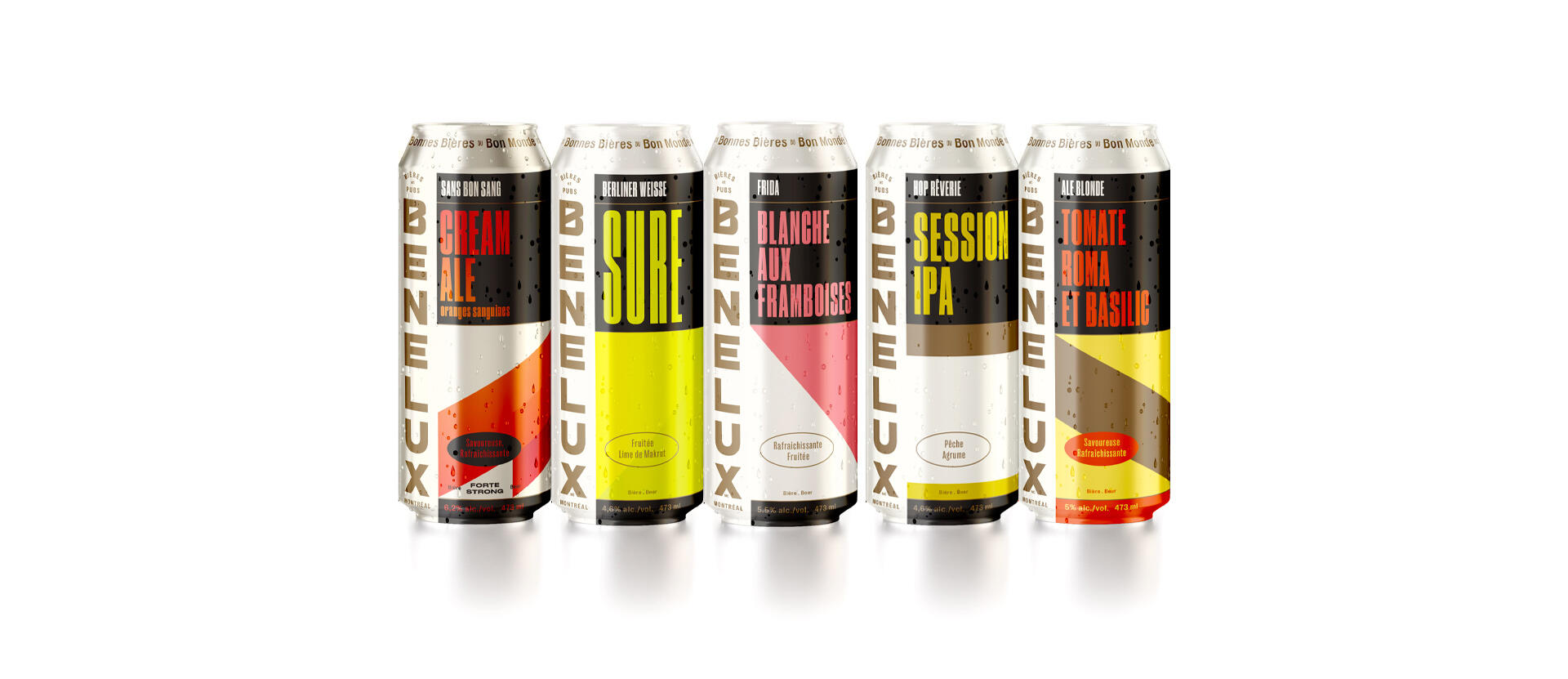
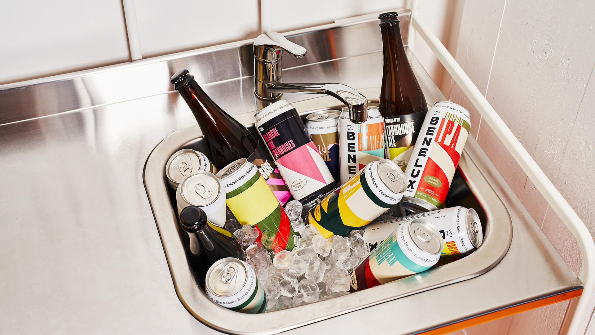
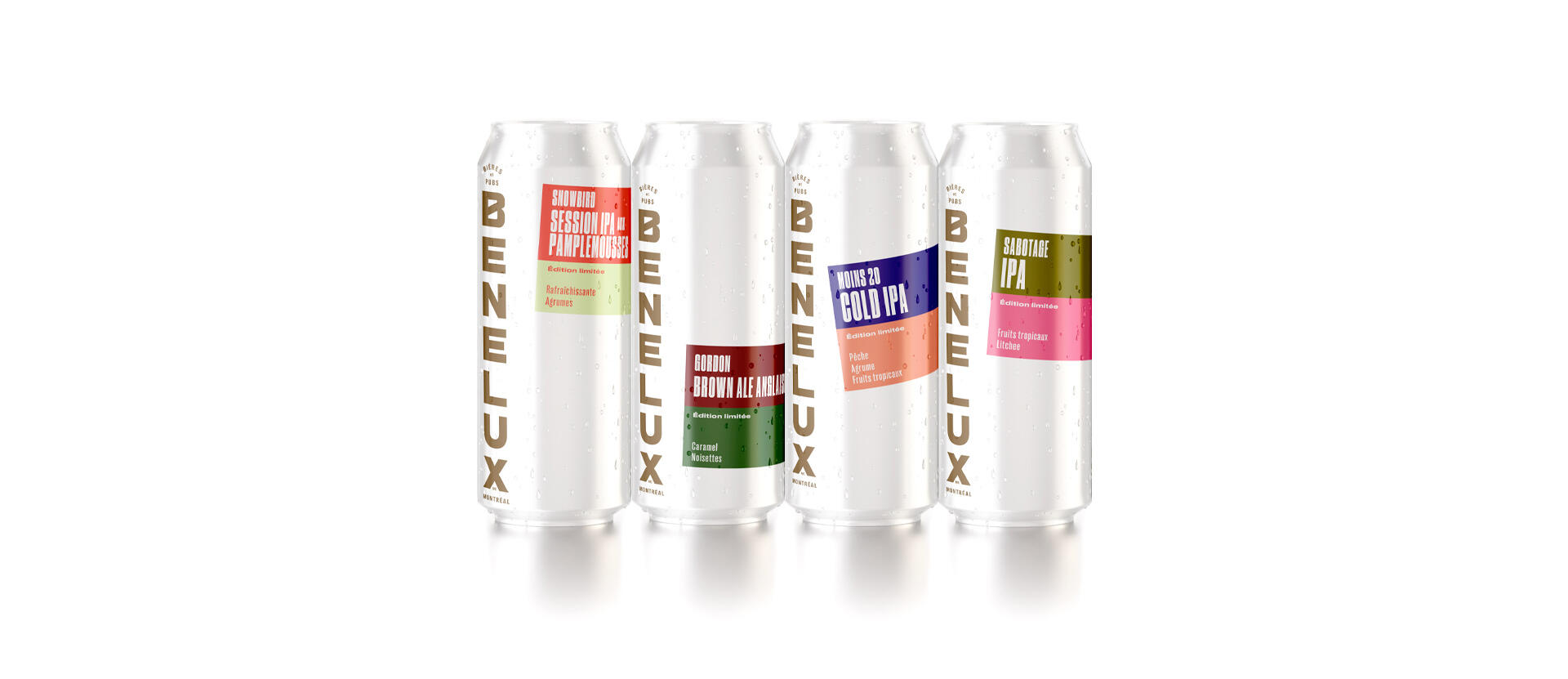
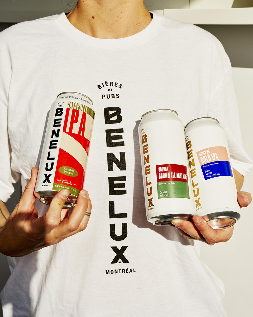
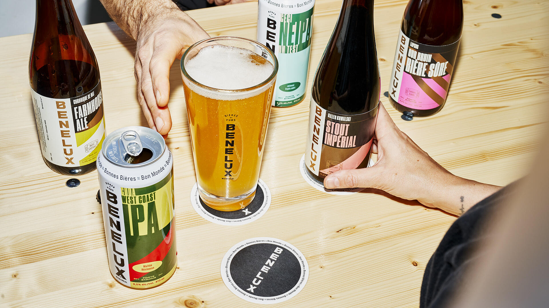
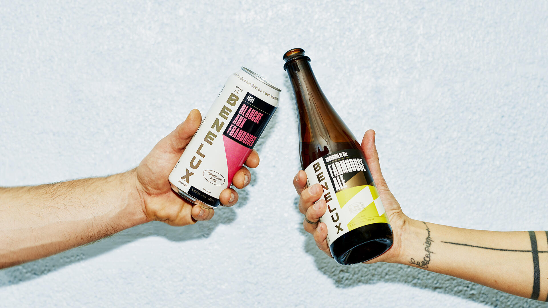
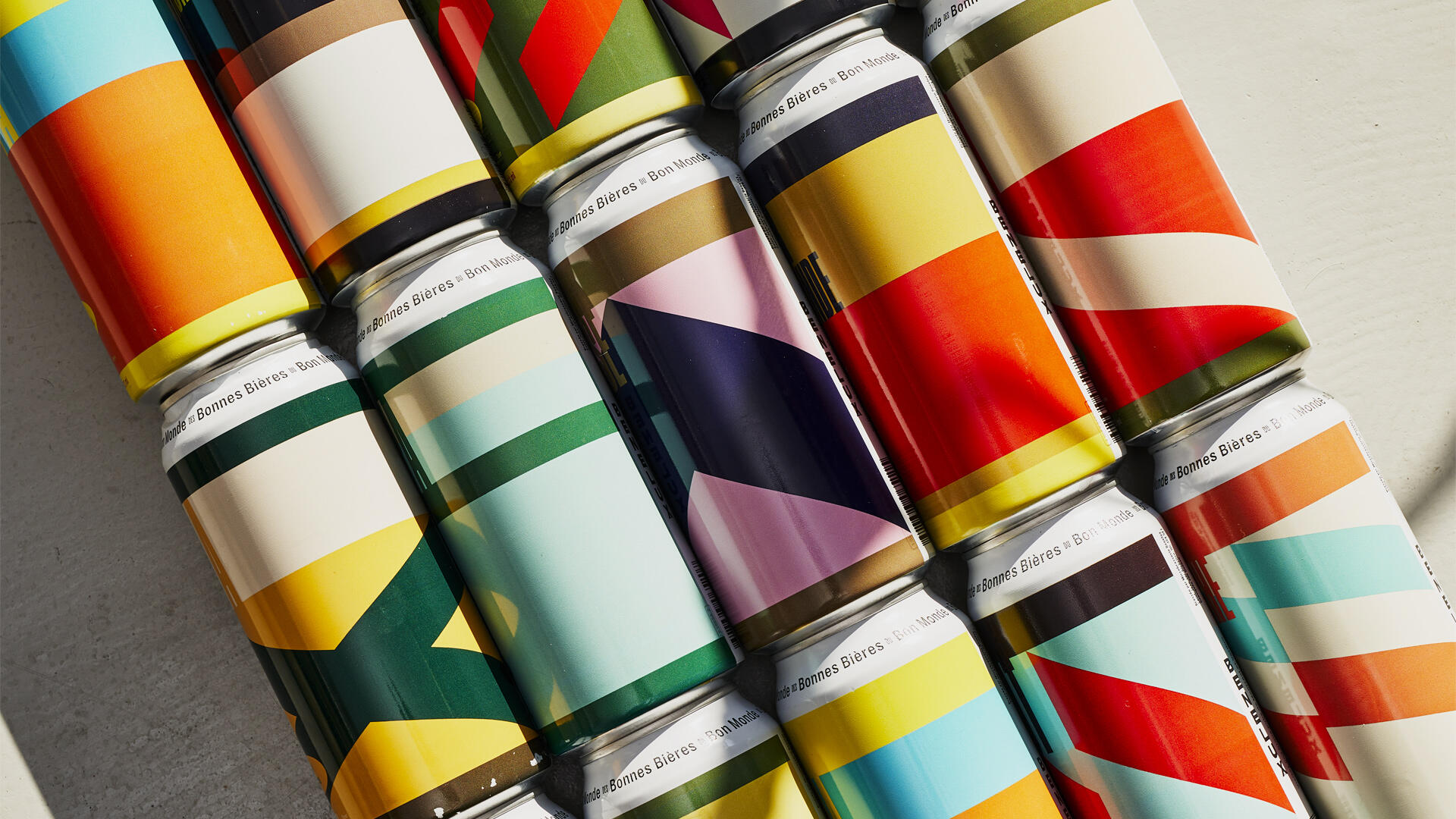
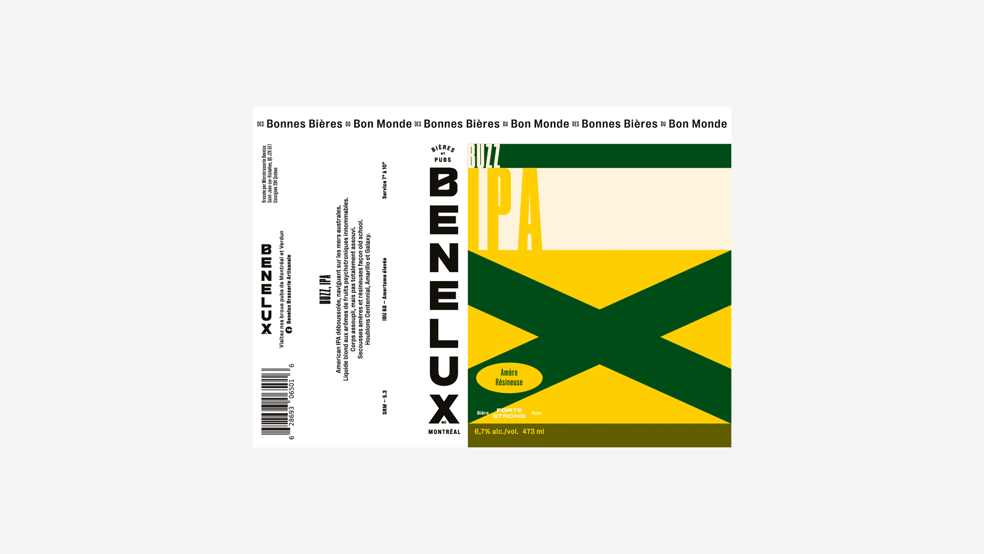
The new logo, while staying true to its previous versions, now stands vertically - reminiscent of an illuminated marquee - paying homage to its neighborhood bar origins. The packaging is adorned with sturdy, colorful motifs, a nod to the flamboyance of local storefronts and/or interpretations of flags and banners.
The beer family is divided into three ranges: Regulars, Creations and Limited Editions, each with its own visual features. The overall result creates a flexible identity system allowing for infinite expansion.
Photography - Thanh Pham


Archives +


Gamme régulière